Mixing colors for metals in oil paint can be a challenging yet rewarding skill to master for artists. The reflective properties of metals require an understanding of the colors and techniques that will bring their vibrancy and texture to life on the canvas. This article aims to provide you with helpful tips and knowledge on how to achieve the desired metallic effects using oil paint.
When painting metals, it is essential to accurately represent the varying degrees of color, reflection, and refraction, which are unique to each type of metal. By carefully selecting the right pigments and blending techniques, you can create realistic and stunning representations of gold, silver, copper, and other metallic surfaces. In the following sections, we will explore the different nuances of mixing colors for metals and the key principles for achieving a more realistic result in your oil paintings.
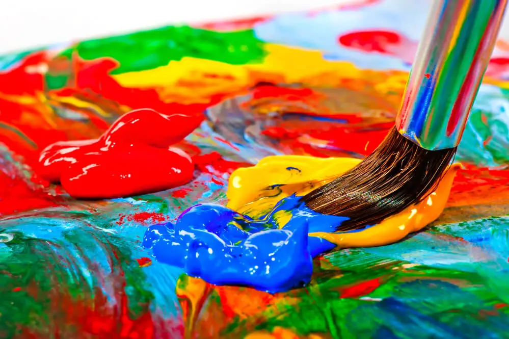
Mastering the art of mixing colors for metals in oil paint can elevate your paintings
Fundamentals of Color Theory
Primary Colors
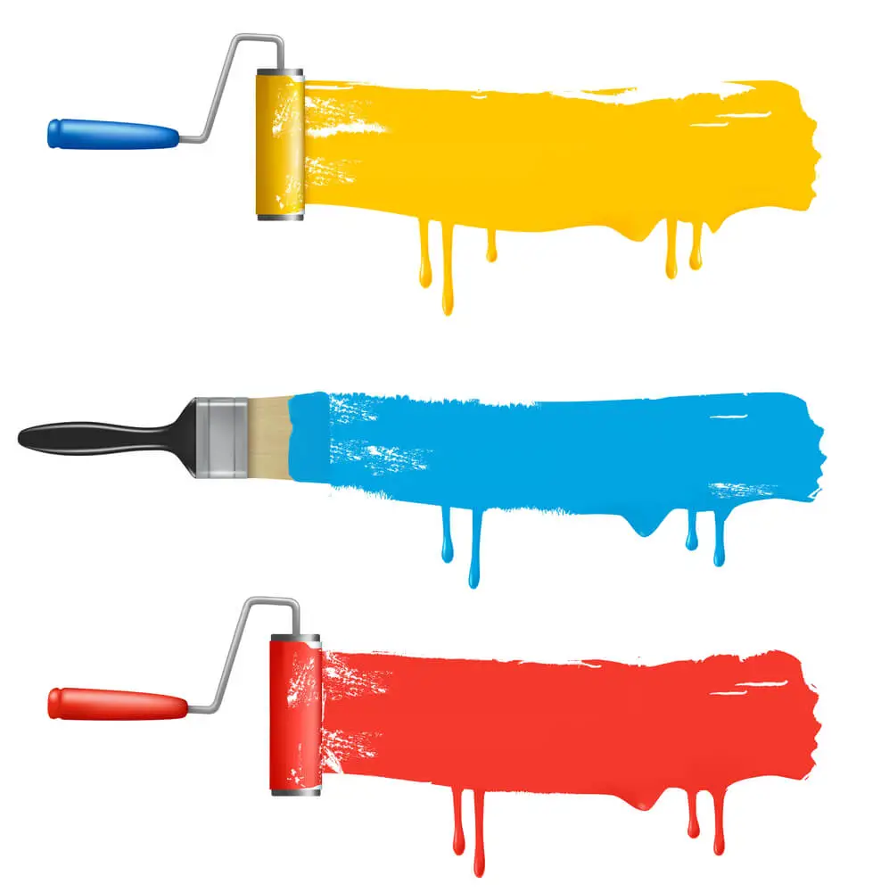
To mix colors for metals in oil paint, understanding color theory is crucial. There are three primary colors: red, yellow, and blue. These colors cannot be made by mixing other colors, but they can be combined to create a wide range of hues.
Color Wheel
The color wheel is a helpful tool for visualizing how colors relate to one another. It consists of a circle with the primary colors (red, yellow, and blue) evenly spaced, and their secondary colors (green, orange, and purple) placed between them. Secondary colors are created by mixing equal parts of two primary colors:
- Red + Yellow = Orange
- Yellow + Blue = Green
- Blue + Red = Purple
Colors arranged on the color wheel also display their relationships in terms of warm and cool tones. Warm colors include red, orange, and yellow, and are considered more energetic and attention-grabbing. Cool colors, like blue, green, and purple, are seen as calming and soothing.
Complementary Colors
Complementary colors are those that lie directly opposite each other on the color wheel. They create visual contrast with one another, making them appear more vibrant when placed side by side. Examples of complementary pairs include:
- Red and Green
- Blue and Orange
- Yellow and Purple
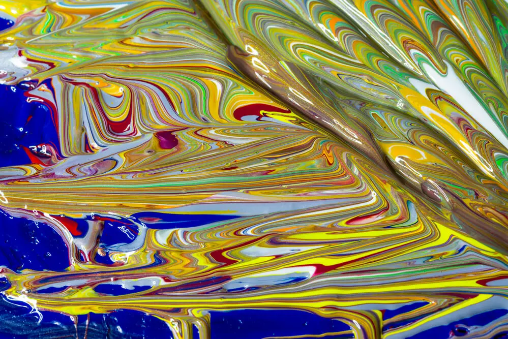
Knowing the fundamentals of color theory will enable you to mix various shades and tones for metals in oil paint. You can create complex, richer colors by understanding the relationships between primary, secondary, and complementary colors, as well as warm and cool hues.
Mixing Colors for Metals
When it comes to painting metallic surfaces in oil, it’s important to mix the right colors to achieve a realistic and convincing effect. This section will provide guidance on mixing colors for various metals such as gold, silver, copper, brass, bronze, and iron oxide.
Gold
To create the base color for gold, mix yellow ocher with a small amount of burnt sienna. Then, incorporate a little bit of white and adjust the balance by adding more yellow ocher or burnt sienna depending on the desired shade. To add highlights, mix white with yellow ocher and a touch of cadmium yellow. For shadows, mix burnt umber with the base color.
Silver
Creating the base color for silver starts with a neutral gray mixed from black and white. Depending on the surface’s shininess, add a touch of blue or purple for a cool undertone. Highlight areas using white mixed with a small amount of the base color. For shadows, add a tiny bit of black to the base color.
Copper
For the base color of copper, combine burnt sienna and yellow ocher. Adjust the intensity by either adding more yellow ocher for a lighter shade, or burnt sienna for a darker shade. To create highlights, mix white into the base color and add a touch of cadmium orange if necessary. For shadows, mix burnt umber with the base color.
Brass
Start by mixing equal parts of yellow ocher and burnt sienna for the base color. Adjust the shade by adding more yellow ocher for a lighter tone or burnt sienna
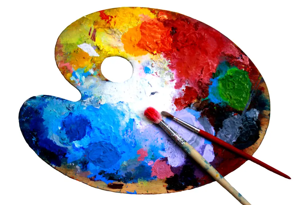
Selecting and Mixing Pigments
Pigments for Metallic Colors
When creating metallic colors in oil paint, selecting the right pigments is crucial. Some pigments that are commonly used for metallic shades are Naples Yellow, Cadmium Yellow, Alizarin Crimson, Burnt Sienna, Sienna, Umber, Burnt Umber, Raw Umber, and Titanium White. Combining these pigments thoughtfully can yield a variety of metallic hues.
Color Values and Saturation
Understanding color values and saturation is essential for achieving a realistic metallic effect. Metallic colors are influenced by the light source, which may impact their value (light to dark) and saturation (color intensity). Experiment with mixing different ratios of the oil paint pigments mentioned above, and be mindful of the
Oil Painting Techniques
Blending Colors
When mixing colors for metals in oil paint, it is important to use the appropriate mediums and diluents. Using a solvent like mineral spirits or a medium like linseed oil can help you achieve the desired consistency and flow of your paint. To blend colors effectively, you can use a palette knife or a brush, applying the “fat over lean” principle to ensure proper drying and adhesion of paint layers.
Creating Texture
To create texture in your metal paintings, consider using a palette knife, which allows you to shape the paint and achieve different effects. Varying the application pressure can create subtle variations in texture and reflection that add depth to your work. You can also experiment with other tools such as different brush types, sponges, or even fingers to achieve desired texture effects.
Light and Shadow
Capturing the nuances of light and shadow is essential for conveying the appearance of metals in your oil paintings. Observe the reflections of light on the metal surface and note how the shape of the object affects these reflections. Identify areas where light is directly hitting the metal, as well as where shadows are cast. Incorporating these elements effectively will enhance the realism and presence of your painted metals.
Application and Tips
Working with Different Paints
When mixing colors for metals in oil paint, it’s essential to understand the characteristics of different paint mediums like acrylic, watercolor, and gouache. While oil paint is the primary focus here, these mediums can influence your color mixing process. Oil paint tends to blend more smoothly compared to acrylics, which dry quickly, and watercolors, which are transparent. Nevertheless, incorporating proper materials and techniques is crucial to produce realistic metallic effects on your canvas.
Color Schemes and Contrast
To create a convincing metallic appearance, it’s important to establish appropriate color schemes. Base your color choices on the metal you want to depict, keeping in mind that metals often have undertones of complementary colors. For instance, copper may have green undertones, while gold can exhibit tinges of purple. To enhance the metallic effect, understanding contrast is critical. Combine darker and lighter shades to create depth and establish the metal’s reflective properties. Play around with various mixtures, such as ultramarine blue for shadows and lighter hues for the highlights.
Avoiding Unwanted Gray Tones
In oil painting, it’s common to encounter unwanted gray tones when mixing colors, especially when blending complementary colors. To prevent your metallics from appearing dull, follow these tips:
- Ensure your tools, such as brushes and palette knives, are thoroughly clean to prevent unintentional blending and muddying.
- Be mindful of the order in which you layer your colors, as inappropriate layering can lead to graying effects.
- Dilute your paint with liquid mediums like linseed oil or solvent to adjust the paint’s consistency and flow.
- Experiment with different pigment mixtures to find the ideal balance between colors that prevent unwanted gray tones.
Exploring Masterful Techniques
Old Masters’ Approach
The Old Masters, revered painters from the Renaissance to the 19th century, employed a methodical yet practical approach to mixing colors for metals in oil paint. Their secret was to achieve realistic metallic effects with a restricted range of colors, often using just the right balance of warm and cool tones. Significant hues they relied on included lead white, Prussian blue, ivory black, and Venetian red.
Unlike modern artists, the Old Masters focused on layering their paints to achieve depth and volume. They began with an underpainting that established the basic tonal values, followed by a series of glazes, each adding subtle shifts in color, texture, and depth. This layering technique helped them achieve an illusion of metals reflecting and absorbing light—a crucial element when depicting metals in artwork.
Limited Palette
Working with a limited palette has many advantages, not just for oil painting but across various mediums. It simplifies the process and helps the artist gain greater control over color harmony. The limited palette the Old Masters used to depict metals consisted of the following colors:
- Lead White: A slightly warm white often used as the base for mixing shades of silver and other lighter metal tones.
- Prussian Blue: A deep, cool blue that, when mixed with other colors, adds a cool tint to the metallic effect.
- Ivory Black: A versatile black pigment that can be used to darken other colors and create depth in your painting.
- Venetian Red: A warm, earthy red with a slightly brownish tone, ideal for producing rich, warm metallic colors like copper and synthesized gold.
By using these four colors, one can create a range of metallic effects by mixing them in varying proportions. Here’s a simple guide to achieve different metallic tones:
| Metal | Color Proportions |
|---|---|
| Silver | High proportion of lead white, mixed with ivory black and a touch of Prussian blue |
| Gold | Equal parts lead white and Venetian red, small amount of ivory black and a hint of Prussian blue |
| Copper | Predominantly Venetian red, with lead white to lighten, ivory black, and a touch of Prussian blue to modulate saturation |
Keep in mind that the ratios provided are just a starting point; the key is to experiment and observe the interactions of these colors to find the right balance that works for your intended metallic effect. With practice and confidence, you’ll master the art of mixing colors for metals in oil paint.
Frequently Asked Questions
What are the essential colors for mixing metallic shades?
To mix metallic shades in oil paint, you need a range of colors that include the base metal color and some additional colors for highlights and shadows. Essential colors for mixing metallic shades are black, white, and a selection of earth tones, such as raw sienna, burnt sienna, raw umber, and burnt umber. Additional colors like yellow ochre, cadmium red, and cadmium yellow can be useful for different metal effects.
How can I create a realistic brass effect using oil paints?
To create a realistic brass effect, start with a base color of raw sienna mixed with some yellow ochre. For highlights, use a mix of yellow ochre and white. For shadows and details, use burnt sienna, burnt umber, or even some black. Apply the colors using small strokes, and blend as needed for a realistic effect.
What techniques can I use to blend colors for a metallic appearance?
To blend colors for a metallic appearance, use a dry brush to soften and blend any hard edges between the base color, highlights, and shadows. Keep the brush strokes small and directional, imitating the texture and natural patina of the metal. Building up layers gradually can also help create depth and enhance the metallic effect.
How do I mix oil paints for a gold or silver finish?
For a golden finish, start with a mix of yellow ochre and raw sienna as the base color. Add white for highlights and burnt sienna for shadows. For a silver finish, use a mix of black and white for a neutral gray base color. Mix in more white for highlights and use pure black for shadows. The key to achieving realistic metallic finishes is in the blending and layering of the colors, as well as the application of highlights and shadows.
Are there any special tools or brushes needed for painting metals in oils?
Standard oil painting brushes and tools are sufficient for painting metals in oils. However, using some specialized brushes, such as small, round, or fan brushes, can help with blending and creating intricate details for a more realistic effect.
Is there a reliable color mixing app to help with creating metallic shades?
There are several color mixing apps available that can help you create custom color palettes for painting, but most are geared toward basic color mixing rather than specifically metallic shades. To achieve the best results with metallic shades, experimentation and practice with your chosen oil paints will yield the most satisfying and accurate results.