
Oil painting is a fascinating and rewarding art form that has been enjoyed for centuries. Its versatility and depth create a rich visual experience, with color schemes playing a crucial role in setting the mood and evoking emotions.
So how to use color schemes? To master the technique of using color schemes in oil painting, it is essential to understand the underlying principles and practice the various techniques consistently.
Color theory is the heart and soul of oil painting, with an understanding of the color wheel and primary, secondary, and tertiary colors critical to achieving harmony in your artwork.
Beyond the basic colors, mixing and applying colors on the canvas allows the artist to explore endless combinations and effects that bring paintings to life.
While there are numerous famous artists to draw inspiration from, it’s essential to develop your personal style and approach to oil painting.
Studying earth tones, whites, and blacks, maintaining your supplies, and practicing confidently will ultimately yield the most satisfaction in your work.
Key Takeaways
- Grasp the fundamental principles of color theory and the color wheel.
- Develop the skill of mixing and applying colors effectively in oil painting.
- Gain inspiration from renowned artists while crafting your unique style.
How to Use Color Schemes
Oil painting is an incredible art form, and mastering the use of color on canvas is essential to creating stunning pieces.
In this section, I will present a brief overview of the basic concepts of color and how to apply them effectively in oil painting.
The first thing to consider is the color wheel, which is a visual representation of how colors relate to one another.
Primarily, it consists of three primary colors: red, yellow, and blue. Green, orange, and purple are secondary colors created by mixing equal parts of two primary colors.
When working with the color wheel, I always keep in mind that mixing complementary colors (colors opposite on the wheel) produces a neutral hue, which is valuable when creating shadows or toning down intense colors.
When it comes to oil painting, it’s essential to understand the characteristics of color, such as hue, value, and chroma.
Hue refers to the basic color, while value represents the lightness or darkness of the color. Chroma, on the other hand, indicates the intensity or purity of a hue.
By adjusting these properties in various combinations, I can create an infinite number of tints, shades, and tones.
The pigments used in oil painting can be either opaque or transparent. Opaque colors are useful for covering previous layers and making corrections, while transparent colors are great for glazes and layering, producing depth and vitality in the finished artwork.
Temperature is another critical aspect of color. Cool colors, like blue and green, tend to recede in composition, whereas warm colors, such as red and yellow, appear to advance.
By skillfully manipulating the temperature of colors, I can create a sense of depth and atmosphere on the canvas.
For a harmonious and cohesive oil painting, I should also be mindful of color schemes. Commonly used schemes include monochromatic (using a single color in various shades and tints), complementary (using colors opposite to the wheel), and analogous (using colors adjacent to the wheel).
By choosing a color scheme and sticking to it, I can ensure my artwork is visually balanced and engaging.
Mastering these fundamental color concepts and applying them thoughtfully in my oil painting practice, I am empowered to create visually stunning and impacting artwork that will stand the test of time.
Color Theory in Oil Painting
When I start an oil painting, understanding color theory is essential to create visually appealing compositions.
The core concepts in color theory include primary, secondary, and tertiary colors. The color wheel is a handy tool that assists me in organizing these colors and figuring out their relationships.
The primary colors are red, blue, and yellow. When I mix two primary colors, I create secondary colors: green, orange, and purple.
Mixing a primary color with a secondary color results in tertiary colors. With these colors, I form a color palette which will help me achieve color harmony in my paintings.
In oil painting, pigments are used to create tints and shades, which help me experiment with lighter and darker versions of a color.
Tinting is achieved by adding white to any color, while shading involves adding black. I find that earth tones, such as ochre or sienna, efficiently balance the composition.
One critical aspect of color harmony is the use of complementary colors. Complementary colors are those opposite to each other on the color wheel, like red and green.
When I use them together, they make each other stand out, creating a visually stimulating composition.
Different color schemes help me bring harmony and structure to my paintings. For example, an analogous color scheme consists of colors that are next to each other on the color wheel, rendering a more subtle effect.
On the other hand, a triadic color scheme uses three equally spaced colors on the wheel, producing contrast and vibrancy.
Sometimes, I prefer using a monochromatic color scheme, which involves using different tints, shades, and tones of a single hue.
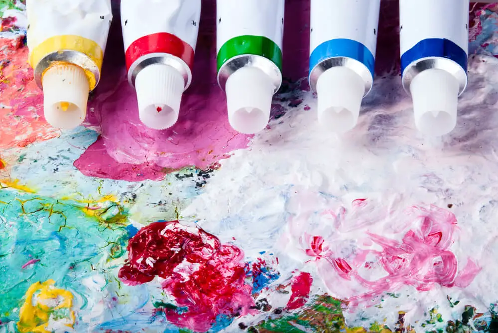
Choosing a Palette for Oil Painting
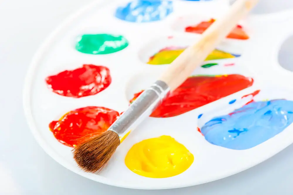
When starting a new oil painting, the first thing I consider is my palette. Selecting the right colors can make a huge difference in achieving the desired mood and atmosphere of my artwork.
Here are some tips on how to create a well-balanced palette for oil painting:
First, I always make sure to include white in my palette. Titanium white is a popular choice due to its opacity and mixing capabilities. White is essential in creating tints and highlights and adjusting the values of other colors.
Next, I chose a few basic oil paints that represent the primary and secondary colors. This typically includes cadmium yellow, cadmium red, ultramarine blue, cadmium orange, cadmium green, and alizarin crimson.
These colors are vibrant, mix well with other hues, and can be great starting points for my color scheme.
Simplicity is key when setting up my palette. I try to limit the number of colors I use for a painting. This helps maintain color harmony and also makes it easier to mix and see the relationships between the colors.
Often, three to five colors are enough to achieve a wide range of tones and shades.
I like to include earthy tones in my palette to create a more natural and harmonious look in my paintings. Colors like yellow ochre, burnt sienna, raw umber, and cobalt blue provide a more grounded and organic feel.
These earthy tones are particularly helpful when painting landscapes or depicting natural elements.
Contrary to popular belief, it is not necessary to have a separate palette for each painting. Acrylics or gesso can be used to cover previous color mixes and create a fresh surface to work with.
This is particularly helpful for artists who paint frequently, as it saves time and conserves materials.
A well-organized palette is essential for successful oil painting. By selecting the right colors and limiting the number of paints used, I can create harmonious, vibrant, and natural-looking artwork.
Different Techniques in Using Color Schemes
When I paint with oil colors, there are several techniques I utilize to achieve a harmonious color scheme.
First, I carefully select my hues and often work with a limited palette. This helps me maintain control over my color mixing and avoid creating unintentional muddy or dull tones.
To create a more dynamic piece, I often use underpainting, a technique where I apply a thin layer of paint to the canvas before working on the main colors.
This helps me establish the overall color scheme and value structure of my painting. I find that using complementary colors in the underpainting stage can create a strong visual impression.
I also experiment with different mediums, such as Gamblin’s range of oil paints and mediums, to enhance color vibrancy and transparency.
For instance, I incorporate glazing techniques, where I apply a thin layer of transparent paint over a dried area of the painting. This adds depth, luminosity, and richness to the colors.
When working in layers, I adhere to the “thick over thin” and “fat over lean” principles. This means that I apply thin layers of paint first, followed by thicker layers containing more oil.
These rules help prevent cracking and ensure that my painting dries evenly and has a consistent texture.
Another technique I enjoy using is alla prima, where I complete the entire painting in one session while the paint is still wet.
This approach allows me to work more spontaneously and achieve a looser, more expressive style.
By exploring and practicing these techniques, I can confidently create a variety of color schemes that enhance the visual impact and harmony of my oil paintings.
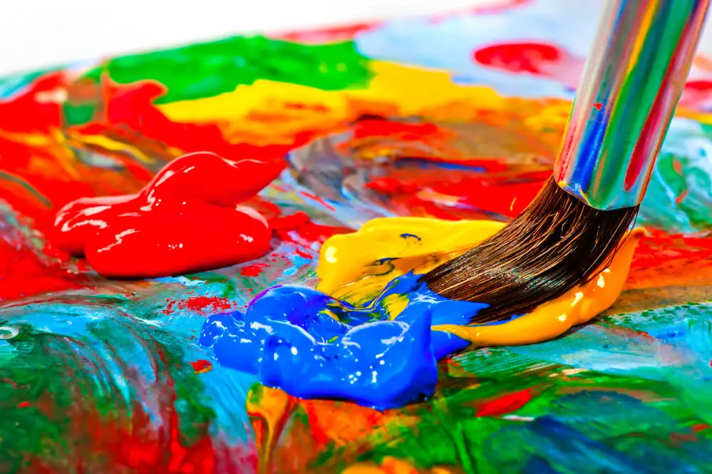
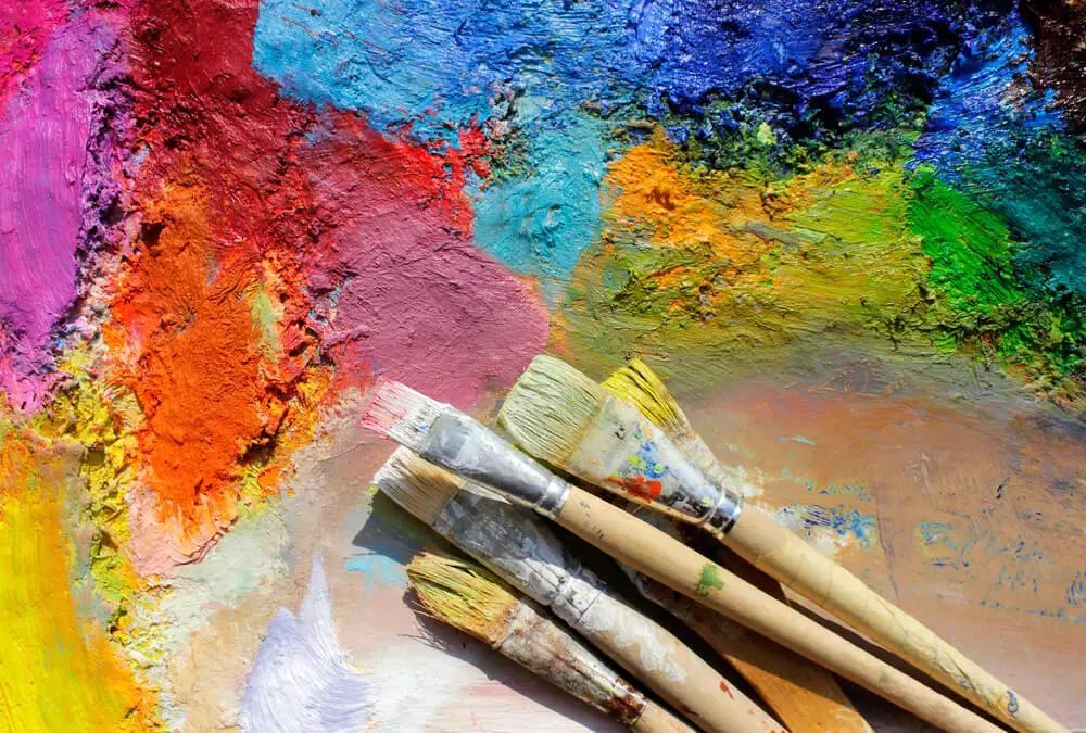
The Art of Mixing and Applying Colors
As an artist, I’ve learned that mastering the art of mixing and applying colors is essential for creating captivating oil paintings.
In my experience, understanding tones, color harmony, and saturation significantly contribute to achieving the desired effect in my artwork.
I usually start by considering color harmony, the way the colors work together to evoke a specific feeling or atmosphere.
A popular method to ensure harmony is the triad, which involves using three equally spaced colors on the color wheel.
This helps strike a balance between warm and cool hues, providing a cohesive effect.
When it comes to color mixing, I find that using a palette knife instead of brushes produces cleaner, more controlled mixes.
Also, it prevents cross-contamination, ensuring that the hues remain pure and vibrant.
Complementary hues (opposite colors on the color wheel) are very useful, as they enhance each other when placed side by side, creating depth and interest.
To ensure a strong value structure, I tend to establish the darkest and lightest values in my painting early on, building and refining the piece through tonal adjustments.
Remember, the right value structure can strengthen the overall composition and contribute greatly to the final outcome.
In my oil painting process, preparing the painting surface is crucial. I often apply a layer of gesso to create a smooth yet slightly textured foundation.
The easel I use is important, too – it should be sturdy, adjustable, and allow for comfortable, unobstructed access to the canvas.
Experimenting with different brush types for varying effects is exciting as well. Brushes with firm bristles work well for laying down broad strokes, while softer brushes are excellent for adding details and blending colors.
The art of mixing and applying colors is a vital skill for any oil painter. By focusing on color harmony, mastering color mixing techniques, and employing the correct tools, an artist can create striking and visually pleasing paintings.
Working with Earth Tones, Whites, and Blacks
As an artist, I find that working with earth tones, whites, and blacks can help create a balanced and natural color scheme for my oil paintings.
These colors form the basis for creating various tints, shades, and tones, enabling me to achieve a visually harmonious piece.
When beginning an oil painting, I start by using earth tones such as burnt umber to establish the foundational values of the composition. Earth tones are versatile and easily blendable, which allows me to create a range of hues and tones effortlessly.
I often use these colors to create warm, organic undertones in my paintings, which can be built upon further as the painting progresses.
Incorporating white into the color scheme is essential for creating tints, the lighter variations of color.
Mixing white with any hue, including earth tones, helps me produce a wide array of tints for highlighting and adding depth to the composition. The key is to add just enough white to create the desired effect without overwhelming the original color.
Black is equally important for creating shades, the darker variations of color. By adding small amounts of black to a hue, I can achieve a range of darker values that are perfect for adding shadows and contrast to the painting.
It’s crucial to exercise caution when adding black since overusing it can result in a muddy or dull outcome.
When working with these essential colors, I often experiment with various mixtures to develop new, unique, and interesting shades, tints, and tones to enrich my painting.
Skillfully blending earth tones, whites, and blacks, I can achieve a balanced and captivating color scheme that brings my artwork to life.
Choosing and Maintaining Your Supplies
When it comes to oil painting, selecting and maintaining the right supplies is crucial. I always consider these important factors when choosing my supplies.
First and foremost, invest in quality oil paints. Good-quality paints have a higher pigment concentration and better consistency, resulting in vibrant and long-lasting pieces.
Experiment with various brands till I find the one that suits my taste, such as Winsor & Newton or Gamblin.
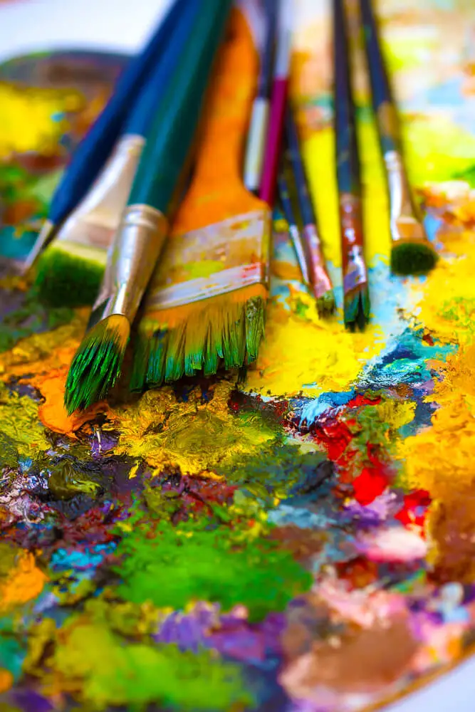
Choosing the right brushes is equally important. To cover a range of techniques, I opt for a variety of sizes and shapes – from filberts to flat brushes.
I make sure to clean my brushes thoroughly with turpenoid, a gentle but effective brush cleaner, after each painting session to maintain their lifespan.
A premium canvas is fundamental to a great painting. When selecting a canvas, I pay attention to factors like texture, size, and material.
Different textures can add unique effects to a painting, so I choose one according to the desired outcome. I also ensure the canvas is pre-stretched and primed to save time and effort.
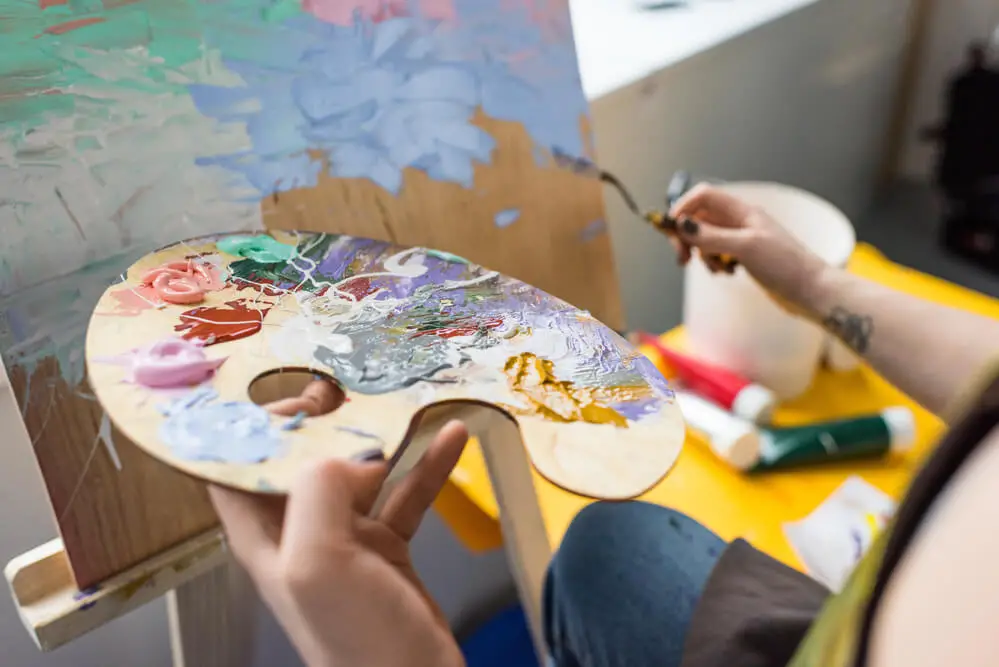
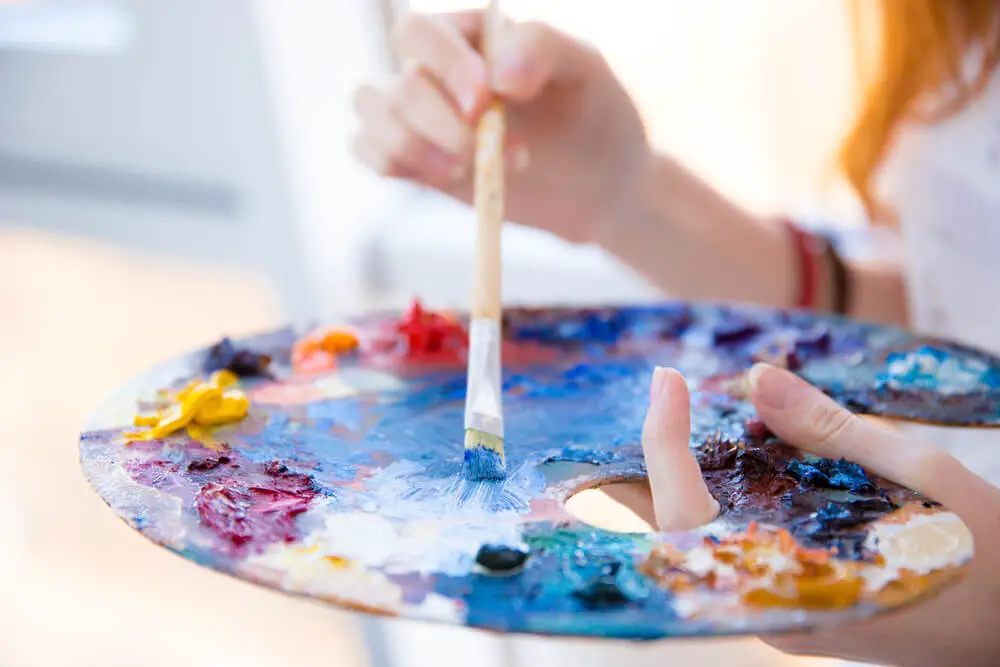
The type of palette I use is up to personal preference, but I prefer glass or wooden palettes for their easy cleaning and neutral background.
After each painting session, I scrape off excess paint and clean the palette using a palette knife and some linseed oil.
Aside from paint and brushes, keep a handy supply of cleaning materials nearby, such as rags and paper towels. They are essential for wiping accidental spills, cleaning brushes, and even for some painting techniques.
Lastly, a sturdy easel is vital for a comfortable painting experience. I am looking for an adjustable one to accommodate different canvas sizes and heights.
Carefully selecting and maintaining my supplies, I am confident in my oil painting process and can focus on creating beautiful artwork.
Influences from Renowned Artists
When I look for inspiration in color schemes for oil painting, I often turn to the works of renowned artists who have mastered the art of using colors in their paintings.
Claude Monet, Vincent van Gogh, Johannes Vermeer, and John Singer Sargent are just a few of the artists who have significantly influenced my understanding of color in oil painting.
Claude Monet, for instance, utilized the technique known as “broken color.” In this technique, the artist applies multiple colors side by side, allowing them to mix visually on the canvas instead of premixing the colors.
This approach creates a vibrant and lively effect, which I believe adds a dynamic flair to my oil paintings.
Vincent van Gogh is another artist whose use of color has left a lasting impression on me. In many of his paintings, he used bold and bright colors, especially yellows, blues, and reds.
Following van Gogh’s example, I often incorporate strong, contrasting colors to evoke emotions and convey the mood of a scene.
The works of Johannes Vermeer, on the other hand, often feature more subtle and muted color palettes. He was known for his masterful use of light and shade, which I try to emulate in my oil paintings, creating a sense of depth and realism.
Vermeer’s use of cool colors, like blues and grays, can enhance my paintings’ atmosphere and generate a calming, serene effect.
Another source of inspiration comes from John Singer Sargent and his approach to the limited palette. The Zorn palette, named after another artist, Anders Zorn, consists of just four colors: white, yellow ochre, cadmium red, and ivory black.
Employing a limited palette, as Sargent did, allows me to simplify my color choices and focus on other aspects of my paintings, such as subject matter and composition.
It also teaches me the importance of mixing and layering colors to create a wide array of shades and tones.
Examining the works and methods of these distinguished artists has allowed me to develop a deeper understanding of color schemes in oil painting and continues to inspire and inform my artistic practice.
Practicing and Gaining Confidence in Oil Painting
As an oil painter, it’s important for me to continually practice and gain confidence in my ability to create beautiful works of art.
One of the ways I do this is by exploring color schemes, as suggested by the Draw Paint Academy.
Understanding color harmonies and color theory, I create visually appealing and balanced compositions.
To practice using color schemes, I like to begin with some basic exercises. I start by creating swatches of colors, paying attention to the intensity and transparency of each pigment.
This helps me see how different colors interact with one another, which is crucial when trying to achieve harmonious color combinations.
During these exercises, I am careful when using certain cadmium, as they can be toxic if not handled properly.
Aside from creating swatches, another useful exercise for building confidence in oil painting is experimenting with various color harmonies, such as complementary, analogous, and triadic color schemes.
Tying out different combinations, I learned how to balance the colors in my paintings by adjusting their intensity and transparency.
Working with oil paints also means adapting to their unique drying time, which can be both an advantage and a challenge.
Oils are more versatile than other mediums, as they allow for longer blending times and smooth transitions between colors.
However, it’s essential to manage my impatience during drying periods and remind myself that it’s part of the process.
This patience is especially important when working with glazes, which can create rich and luminous effects by layering transparent oil colors.
In conclusion, as an oil painter, practicing color harmonies and understanding color theory helps me build confidence in my work.
Performing different exercises and familiarizing myself with the properties of oil paints, I can continually improve my skills and create visually striking paintings.
Frequently Asked Questions
What are the best color schemes for oil paintings?
In my experience, the best color schemes for oil paintings largely depend on the subject matter, style, and desired mood.
Some popular color schemes include complementary colors (colors opposite to the color wheel), analogous colors (colors adjacent to the color wheel), and monochromatic colors (variations of a single color).
Experimenting with these schemes can help you find the ideal combination for your artwork.
How can I create a balanced color palette in my artwork?
To create a balanced color palette, I start by selecting a dominant color.
From there, I incorporate additional colors based on the chosen color scheme (complementary, analogous, or monochromatic) and consider the overall mood I want to evoke.
If the composition feels unbalanced, I adjust the values (lightness and darkness) and saturation (intensity) of the colors accordingly.
Which famous artists are known for their unique color palettes?
Many famous artists have been known for their distinct color palettes.
For instance, Vincent van Gogh was famous for his bright, contrasting colors, often using complementary color schemes, while Claude Monet was known for his soft, natural palettes in his Impressionist paintings.
Henri Matisse’s work often showcased bold, vibrant colors, and Mark Rothko’s paintings featured large, bold fields of color.
What are some techniques for choosing colors in a painting?
When I choose colors for a painting, I consider the emotions I want to express and the desired mood for my piece.
To help guide my decision, I often make small color studies on a separate canvas or paper. I try various color schemes, adjust value and saturation, and evaluate their effects.
This process helps me understand the visual impact of the colors before implementing them on a larger scale.
How do artists efficiently arrange oil paints on a palette?
In my practice, I typically arrange oil paints on the palette in the order they appear on the color wheel or based on their temperature (warm and cool colors). This system helps me easily locate and mix colors during the painting process.
I also include additional containers for medium and solvent and designated spaces for mixing colors. A well-organized palette streamlines the creative process.
How can color theory be applied to enhance an oil painting?
To enhance my oil paintings, I apply color theory principles like complementary and analogous colors, as well as color harmony.
By intentionally selecting contrasting or harmonious colors, I evoke specific emotions and create visual interest in my work.
I also consider value and saturation to emphasize or subdue elements within the composition, ultimately enhancing the overall impact and storytelling within the painting.