Introduction to Color Psychology in Oil Painting
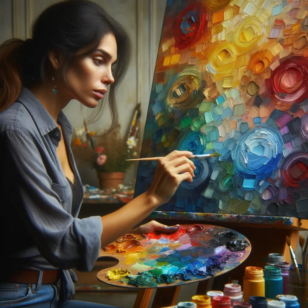
Color is a powerful tool in the hands of an artist. It can evoke emotions, tell a story, and even alter our mood. In the world of oil painting, understanding the psychology of color is crucial. Let’s delve into the fascinating world of color psychology in oil painting.
- Understanding the role of color in art
- Psychological effects of color in art
- Importance of color symbolism in painting
Color is more than just a visual element in art; it is a fundamental tool for communication. Artists use color to express emotions, set the mood, and bring their visions to life. For instance, warm colors like red and orange can evoke feelings of warmth and comfort, while cool colors like blue and green can create a calming and peaceful atmosphere. In oil painting, the use of color is even more pronounced due to the medium’s richness and depth. Learn more about the role of color in art here.
Colors can have profound psychological effects on the viewer. They can evoke certain emotions and feelings, influencing how we perceive and interpret the artwork. For instance, red is often associated with passion and intensity, while blue can evoke feelings of tranquility and calmness. Understanding these psychological effects can help artists create more impactful and meaningful artworks. Discover more about the psychological effects of color here.
Color symbolism plays a significant role in painting. Different cultures associate different meanings and emotions with colors. For instance, in Western cultures, white often symbolizes purity and innocence, while in many Eastern cultures, it represents mourning and death. By understanding color symbolism, artists can convey deeper meanings and messages in their paintings. Find out more about color symbolism in painting here.
In conclusion, color psychology is a fascinating and crucial aspect of oil painting. By understanding the role of color, its psychological effects, and its symbolism, artists can create more impactful and meaningful artworks. So, the next time you look at an oil painting, take a moment to appreciate the colors and the emotions they evoke. You might be surprised at what you discover.
Understanding Color Theory in Art
Color theory is a fundamental concept in art and design that helps us understand how colors interact with each other. It is a guide to visual harmony and contributes to the creation of a visual aesthetic that can evoke specific emotions or reactions. Let’s delve into the basic principles of color theory.
Basic Principles of Color Theory
Color theory revolves around three basic principles: primary, secondary, and tertiary colors; the color wheel and color relationships; and the distinction between warm and cool colors. Understanding these principles can help artists create more impactful and visually appealing works.
- Primary, Secondary, and Tertiary Colors
- Color Wheel and Color Relationships
- Warm and Cool Colors
Primary colors are the building blocks of all other colors. They are red, blue, and yellow. When you mix two primary colors, you get secondary colors: green, orange, and purple. Tertiary colors, such as red-orange or blue-green, are created by mixing a primary color with a secondary color. These colors form the basis of all color combinations in art. Learn more about primary, secondary, and tertiary colors here.
The color wheel is a visual representation of color relationships. It shows how primary, secondary, and tertiary colors relate to each other. Colors opposite each other on the wheel are complementary, while those next to each other are analogous. Understanding these relationships can help artists create balanced and harmonious color schemes in their work. Find out more about the color wheel and color relationships here.
Colors are also categorized as warm or cool. Warm colors, like red, orange, and yellow, are associated with energy, brightness, and action. Cool colors, such as blue, green, and purple, evoke feelings of calm and relaxation. Artists use these color temperatures to create mood and atmosphere in their work. Discover more about warm and cool colors here.
Applying Color Theory in Oil Painting
Color theory is a crucial aspect of oil painting. It’s not just about making your artwork look vibrant and appealing, but it’s also about communicating your ideas and emotions effectively. Let’s delve into how color theory can be applied in oil painting.
- Use of color in oil painting to create depth and perspective
- Creating mood and emotion with color
- Case Study: Use of color in famous oil paintings
Colors play a significant role in creating depth and perspective in oil paintings. By using darker shades in the foreground and lighter shades in the background, artists can create a sense of depth and distance. This technique, known as atmospheric perspective, is a powerful tool in the hands of skilled artists. For example, in Leonardo da Vinci’s “Mona Lisa”, the artist uses a gradient of colors to give the illusion of depth and distance.
Colors can evoke a wide range of emotions and moods. Warm colors like red, orange, and yellow can evoke feelings of warmth, comfort, and excitement. On the other hand, cool colors like blue, green, and violet can create a calming and soothing effect. For instance, Vincent Van Gogh’s “Starry Night” uses vibrant blues and yellows to create a sense of wonder and excitement.
Let’s take a closer look at how color theory is applied in some famous oil paintings.
| Artist | Painting | Use of Color |
|---|---|---|
| Pablo Picasso | The Blue Period | Picasso used monochromatic blues to evoke feelings of sadness and despair. |
| Claude Monet | Water Lilies | Monet used a variety of colors to create a sense of tranquility and reflection. |
| Edvard Munch | The Scream | Munch used bold, contrasting colors to evoke feelings of anxiety and fear. |
As we can see, color theory is not just about choosing pretty colors. It’s a powerful tool that artists can use to create depth, evoke emotions, and tell stories. So next time you pick up your paintbrush, remember to think about what your colors are saying.
The Psychology of Colors in Oil Painting
Colors play a significant role in the world of art, particularly in oil painting. They have the power to evoke emotions and create a certain mood or atmosphere. This is the fascinating field of color psychology in oil painting.
Emotional Impact of Colors
Colors can stir up various emotions within us. Let’s delve into how different colors evoke different emotions and look at some examples of the emotional impact of colors in famous paintings.
- How different colors evoke different emotions
- Examples of the emotional impact of colors in famous paintings
Each color has a unique psychological value. For instance, red often symbolizes passion and energy, while blue can evoke feelings of calmness and serenity. Yellow, on the other hand, is associated with joy and optimism. Artists use these emotional associations to their advantage, choosing colors that will evoke the desired emotional response in the viewer.
Many renowned artists have skillfully used color to evoke emotion. For example, in Vincent Van Gogh’s “Starry Night,” the swirling blues and yellows create a sense of wonder and awe. In contrast, Edvard Munch’s “The Scream” uses harsh reds and oranges to convey a sense of panic and terror. These examples illustrate how colors can significantly influence the emotional impact of a painting.
Understanding the psychology of colors in oil painting can enhance your appreciation of art. It can also provide valuable insights if you’re an aspiring artist. Remember, the colors you choose can profoundly affect how your artwork is perceived and experienced.
Color Symbolism in Painting
Color symbolism is a powerful tool in art. It can convey deep meanings and evoke strong emotions. Let’s delve into the fascinating world of color symbolism in painting.
-
Understanding Color Symbolism in Different Cultures
Color symbolism varies significantly across different cultures. For instance, in Western cultures, white often symbolizes purity and innocence, while in some Eastern cultures, it represents mourning and death. This Wikipedia article provides a comprehensive overview of color symbolism in various cultures.
-
How Artists Use Color Symbolism in Their Work
Artists use color symbolism to convey their message and evoke specific emotions. For example, Vincent Van Gogh’s “Starry Night” uses vibrant blues and yellows to create a sense of wonder and tranquility. On the other hand, Pablo Picasso’s “Guernica” uses a stark black and white palette to communicate the horrors of war.
-
Case Study: Color Symbolism in Famous Oil Paintings
Let’s look at a case study of color symbolism in famous oil paintings. Claude Monet’s “Water Lilies” series is a great example. Monet used a variety of colors to depict the changing light and atmosphere of his garden at different times of the day. The cool blues and greens symbolize peace and tranquility, while the vibrant pinks and oranges evoke a sense of joy and vitality.
Painting Artist Colors Used Symbolism Starry Night Vincent Van Gogh Blues, Yellows Wonder, Tranquility Guernica Pablo Picasso Black, White Horrors of War Water Lilies Claude Monet Blues, Greens, Pinks, Oranges Peace, Tranquility, Joy, Vitality
Oil Painting Techniques for Effective Color Use
One of the most fascinating aspects of oil painting is the ability to create vibrant and dynamic colors. This can be achieved through various techniques, one of which is layering and glazing.
Layering and Glazing
Layering and glazing are two techniques that can significantly enhance the color in your oil paintings. They involve applying thin layers of transparent or semi-transparent oil paint to create depth and luminosity.
- How layering and glazing can enhance color in oil painting
- Examples of effective layering and glazing in oil painting
Layering involves applying multiple layers of paint, allowing each to dry before adding the next. This technique allows for a rich, complex color that can’t be achieved with a single layer. Glazing, on the other hand, involves applying a thin, transparent layer of paint over a dry layer. This can create a beautiful, glowing effect, as the light passes through the glaze and reflects off the layer beneath.
Many famous artists have used layering and glazing to create stunning effects in their oil paintings. For instance, the Dutch artist Rembrandt was known for his use of glazing to create depth and luminosity in his portraits. Similarly, the Italian artist Leonardo da Vinci used layering to create complex colors and textures in his paintings, such as the Mona Lisa.
In conclusion, layering and glazing are powerful techniques for enhancing color in oil painting. By understanding and applying these techniques, you can create vibrant, dynamic colors that bring your artwork to life.
Color Mixing Techniques
Color mixing is a fundamental skill in oil painting. It involves combining different hues to create new shades. Understanding how to mix colors effectively can greatly enhance your artwork and allow you to achieve a wider range of effects. Let’s delve into the world of color mixing for oil painting.
- Understanding color mixing for oil painting
- Techniques for achieving desired color effects
- Case Study: Color mixing techniques in famous oil paintings
Color mixing for oil painting is not as straightforward as it may seem. It involves more than just combining two colors to get a third. You need to understand the properties of each color, such as its hue, value, and saturation. For instance, mixing blue and yellow doesn’t always result in green. Depending on the specific shades of blue and yellow used, the resulting color could range from a bright green to a dull, muddy brown. Therefore, it’s crucial to experiment with different combinations to understand how colors interact.
There are several techniques you can use to achieve the desired color effects in your oil paintings. One such method is layering, where you apply thin layers of different colors on top of each other. This can create a rich, complex color effect that’s not possible with a single layer of paint. Another technique is glazing, which involves applying a thin, transparent layer of color over a dried layer of paint. This can enhance the depth and luminosity of the colors in your painting.
Many famous artists have used color mixing techniques to great effect in their oil paintings. For example, Vincent Van Gogh’s “Starry Night” is renowned for its vibrant and expressive use of color. Van Gogh achieved this effect by layering and mixing different hues of blue and yellow to create a swirling, luminous night sky. Another example is Claude Monet’s “Water Lilies” series, where he used a combination of layering and glazing techniques to create a variety of subtle color effects, capturing the changing light and atmosphere of his garden pond. You can learn a lot from studying these and other masterpieces, and apply the same techniques to your own work.
Color mixing is a powerful tool in the hands of an artist. By understanding how to mix colors effectively and using the right techniques, you can create a wide range of effects and bring your oil paintings to life. So don’t be afraid to experiment and try new combinations. The possibilities are endless!
Conclusion: The Power of Color in Art
As we reach the end of our journey exploring the world of color in art, particularly in oil painting, let’s take a moment to reflect on the key points we’ve learned.
- Recap of the psychological effects of color in art: Color is not just a visual element in art; it’s a powerful psychological tool. Different colors can evoke different emotions and reactions. For instance, red can symbolize passion or anger, while blue can evoke feelings of calmness or sadness. Artists use these effects to their advantage, creating pieces that resonate with viewers on a deeper level. Learn more about color psychology here.
- The role of color in oil painting: Oil painting allows for a unique exploration of color. The medium’s slow drying time lets artists blend colors directly on the canvas, creating smooth transitions and a rich depth of color. This is why oil paintings often have a luminous quality that other mediums struggle to replicate. The choice of color in oil painting can significantly impact the mood, tone, and interpretation of the artwork.
- Key takeaways on the use of color in oil painting: Understanding color theory is crucial for any artist, but especially for those working with oil paints. Mastering the color wheel, knowing how to mix colors, and understanding the psychological effects of different hues can all elevate your artwork. Remember, color is a powerful tool in an artist’s arsenal. Use it wisely to convey your message and evoke emotion in your viewers.
In conclusion, the power of color in art, particularly in oil painting, is immense. It can transform a simple image into a captivating piece of art that speaks volumes. So, as you continue your artistic journey, remember to harness the power of color and use it to its full potential.